Data Dashboard
Definitions, examples, and best practices. This guide provides practical advice to help you create world-class data dashboards of your own.
What is a Data Dashboard?
A data dashboard is an interactive tool that allows you to track, analyze, and display KPIs and metrics. Modern dashboards allow you to combine real-time data from multiple sources and provide you AI-assisted data preparation, chart creation, and analysis. In this way, data dashboards turn raw data from across your organization into data-driven insights that improve a specific process, a department, or your entire business.
Data Dashboard Benefits
Here are the four key benefits of any modern, well-designed dashboard.
- Track and analyze your KPIs and metrics. Data dashboards make it easy for everyone to gauge progress against KPIs and metrics. KPIs (key performance indicators) are targets your teams should shoot for to make the most strategic impact on your organization. For example, a KPI might be, “new clients per quarter”. Metrics are measures of everyday activities that support your KPIs. An example metric might be, “monthly prospect calls”.
- Turn big data into big value. Visualizing data from a wide range of sources across your organization in charts, graphs, and maps on data dashboards helps you and other stakeholders understand and engage with your data and then gain insights that improve your business decisions.
- Make faster decisions. Well-designed dashboards tell you a story about your data at a quick glance. The best data dashboards offer real-time analytics, letting you analyze and respond to real-time information about your products, customers, and applications as it is generated.
- Make better forecasts. Top tools allow you to embed predictive analytics right within your dashboards. These AI-powered dashboards help you make predictions about future outcomes based on historical and current data. These predictions help you create more accurate forecasts, mitigate risk, improve efficiency, and identify opportunities.
Data Dashboard Examples by Industry
Top dashboard software tools make it easy to customize dashboards to serve distinct purposes for different industries and departments. Here are high-performing examples from specific industries.
-
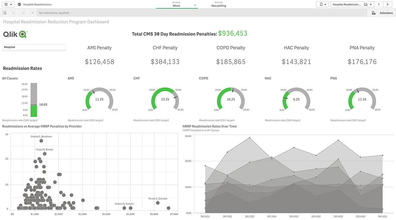
Healthcare
Healthcare digital dashboards allow you to quickly analyze important patient care KPIs to improve outcomes, discover operational inefficiencies, more effectively manage your workforce, and increase profitability. -
Consumer Products
Analyze consumer trends in a single view to help you maximize sales, increase market share and consumer loyalty, and manage intelligent supply chains. -
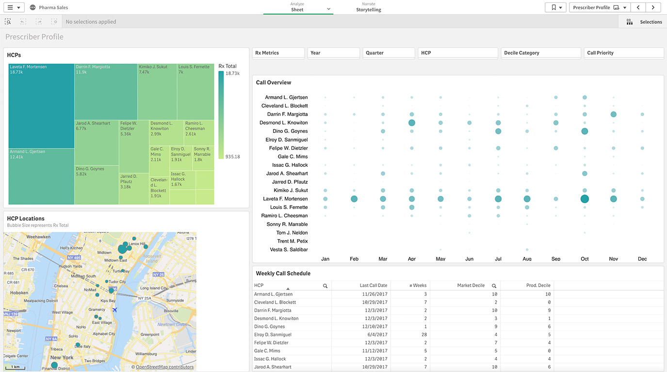
Life Sciences
Digital dashboards let you easily explore and combine your CRM data with market share data, letting you adapt quickly to change and target customers more effectively.
-
High Tech
Clear visualizations will help you gain visibility over your global supply chain, maximize profitability, accelerate innovation, and deliver far more agile operations. -
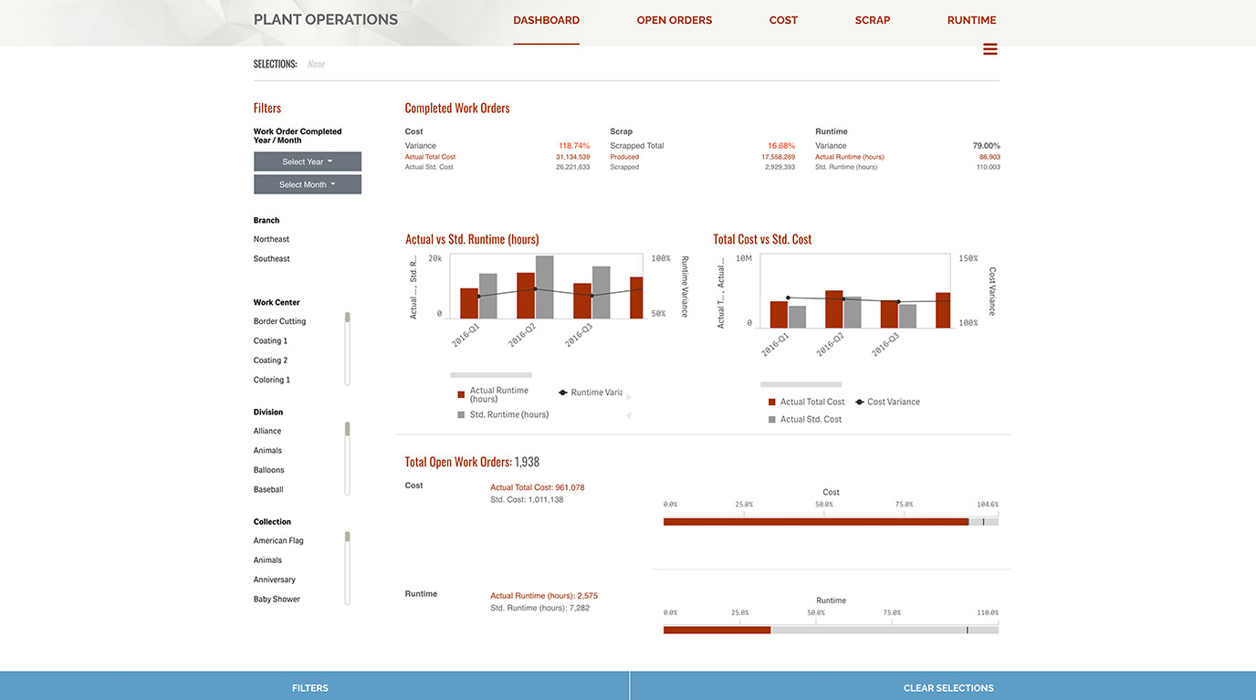
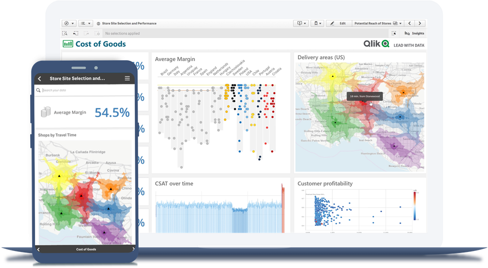
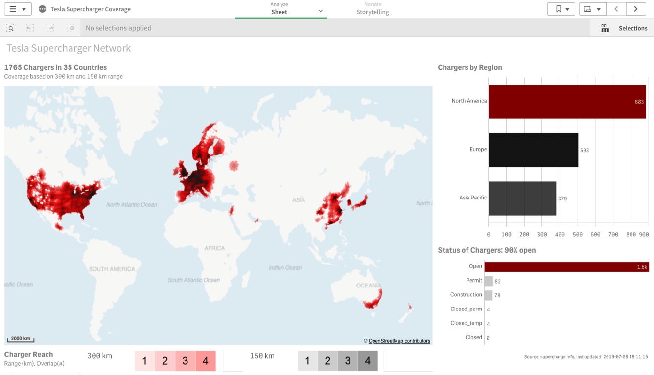
Manufacturing
A manufacturing dashboard lets you visualize the finest details of your plant operations, compare actuals against standards for your most important KPIs, and find unexpected supply-chain and operational efficiencies. -
Retail
View your most important KPIs in one location. Leverage the data to analyze shopping patterns by channel, drive sales and shopper engagement, and maximize profit.
-
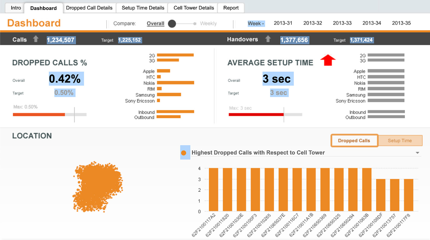
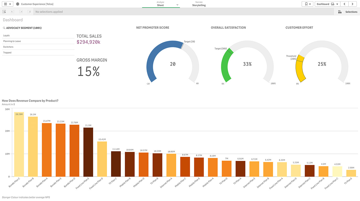
Media & Telecom
Immediately view KPIs that help you navigate fluctuating markets, centralize your processes, and improve customer loyalty. -
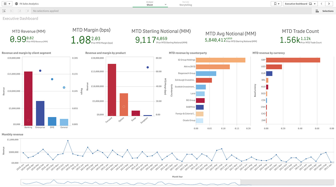
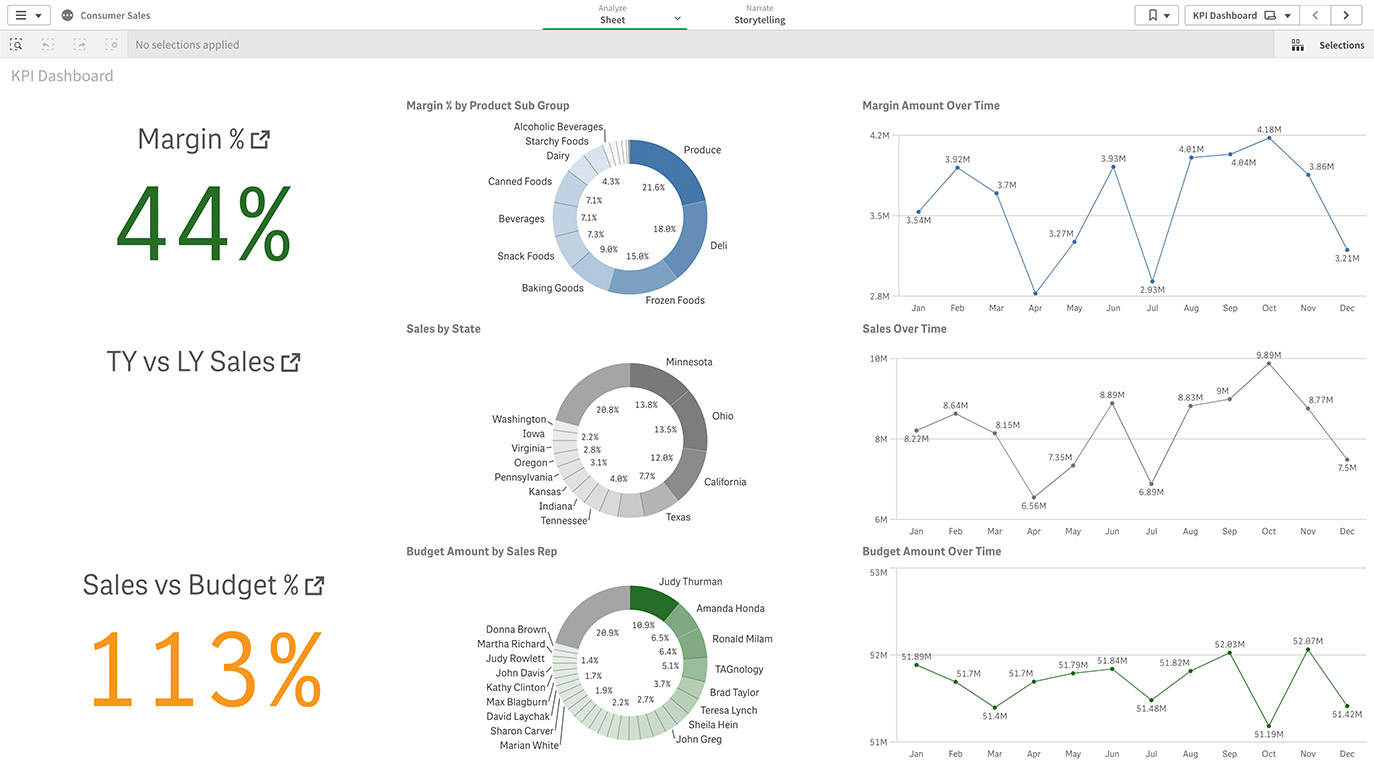
Financial Services
A custom dashboard for comparing revenue and margin data will help you identify your most profitable customers, spot ways to reduce operational costs, and find opportunities to transform your team's performance.
Inspire action with your data. Learn about the latest visualizations and how to choose the right ones to highlight the most important aspects of your data.
Data Dashboard Examples by Department
Here are data dashboard examples based on KPIs and metrics relevant to specific roles in an organization.
-
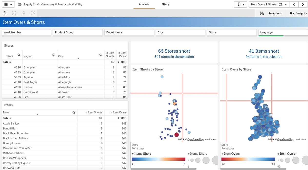
Supply Chain
Supply chain leaders must deal with a wide range of complex, disparate data sources. This example shows how a supply chain analytics dashboard helps you find connections between these sources and gain insights into the procurement, processing and distribution of goods. -
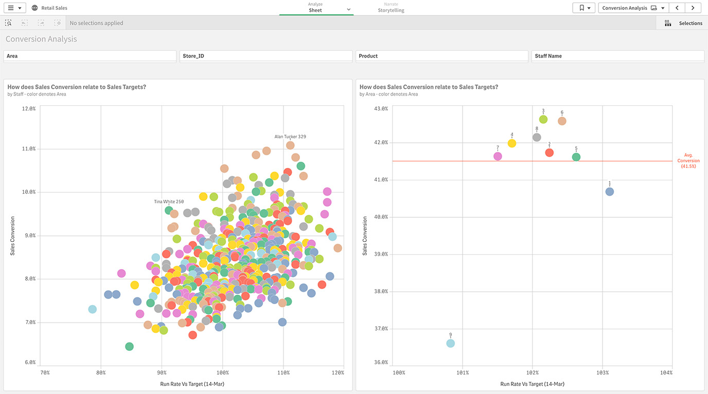
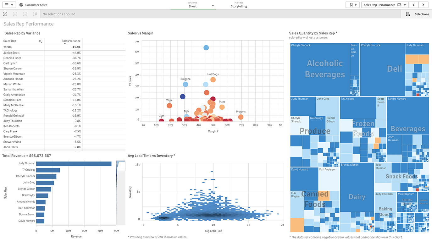
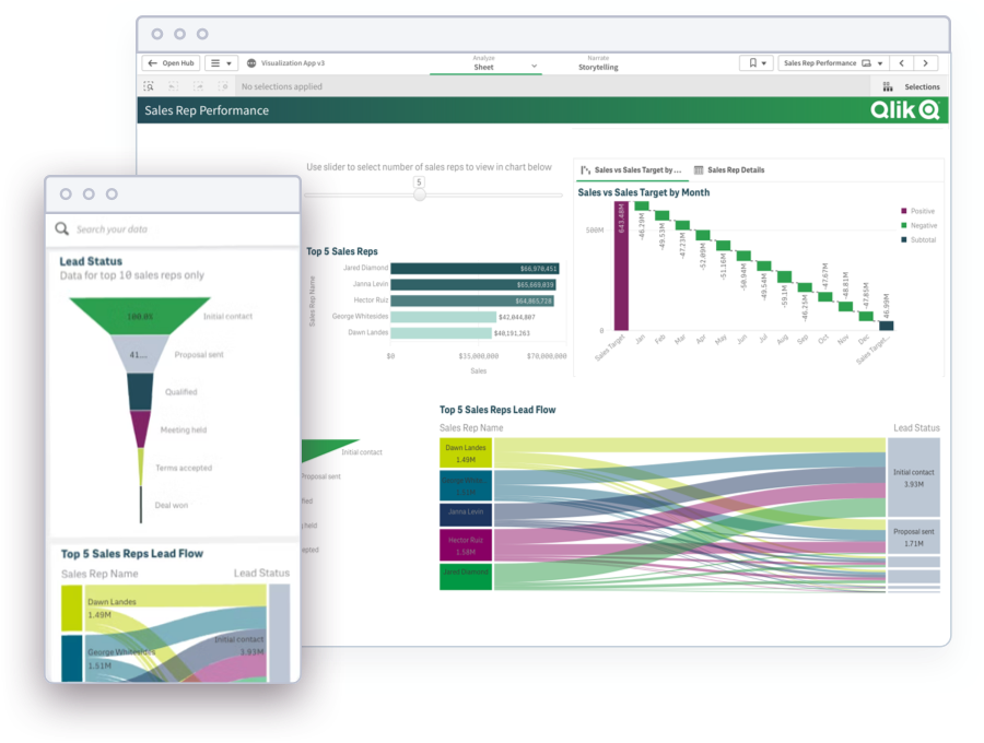
Sales
A clean, well-organized sales dashboard integrates your CRM, finance, and marketing systems. This makes it much easier to get insights that help you identify trends, forecast more accurately, and close more deals. -
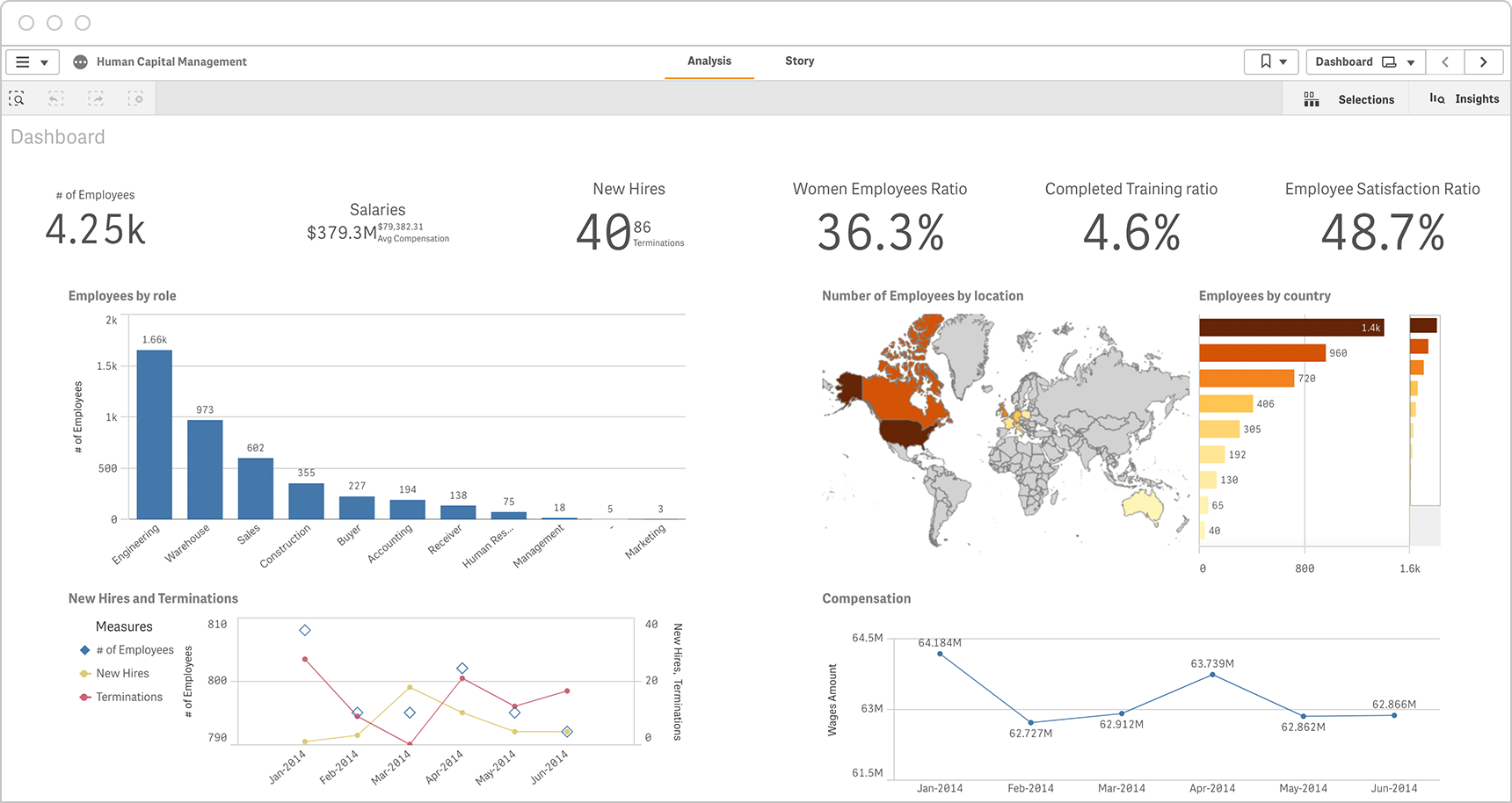
Human Resources
HR dashboards provide Human Resources leaders with quick snapshots of critical KPIs in a single location. They can dig into the dashboard and analyze KPIs such as gender ratio, training progress, and employees by role and by location.
-
Marketing
Marketing dashboards connect data from a range of sources such as your web analytics platform, CRM, and advertising tools. This brings a complete picture of every stage of the marketing and sales funnel, helping you boost your marketing ROI. -
Finance
Finance leaders can leverage financial analytics within a dashboard to explore expense, procurement, and contract data to discover innovative ways to manage costs, control risk, and increase profits. -
IT Digital Dashboard
Improve security, scalability and data governance through better data visualization. Identify underused systems and applications, and better anticipate upcoming technology needs.
How to Create a Data Dashboard
Here are a few best practices to consider as you build your own dashboards.
Find and connect your data.First, find the data–even real-time data–you'll need to power your dashboards. This data will likely be in different formats and reside in different places such as spreadsheets, data marts, or a data warehouse. Your dashboard tool should be able to combine and transform that raw data into business-ready data you can trust.
Don’t just measure. Measure what matters.Work with your other stakeholders to identify the goals with the most impact on your strategic business outcomes. Use a KPI planner to guide you in defining your KPIs.
Keep your visuals simple.You may be tempted to dive right in and create all sorts of line charts, bubble charts, bar charts, and scatterplots. But stuffing too many complex visualizations in your dashboards can actually make it harder to get quick insights. Try different layouts until you have a dashboard that presents your stories in a clean, simple way..
Keep a consistent look and feel.You and other stakeholders will be able to find the information you’re looking for faster if your dashboard design maintains consistency in look and feel such as layout, colors, styles, and icons.
Embed dashboards where decisions are madeTop dashboard tools make it easy for you to embed (or insert) a dashboard or chart into other apps, business processes, portals, and websites. This lets you explore your data wherever and whenever you or your teams make decisions.
How to Design Best-in-Class Dashboard Templates
Download our ebook with 4 must-see dashboard examples.
Common Dashboard Mistakes
Here are the top mistakes to avoid as you create your dashboards.
- Using inaccurate or incomplete data.
- Not clearly defining the stakeholder needs and the goal for the dashboard.
- Not selecting the right type of visualizations to tell your data story.
- Jamming too many KPIs and visualizations onto the dashboard.
- Not adhering to dashboard design best practices.
- Using excessive jargon, acronyms and complex technical terms.
- Not enabling dynamic capabilities such as drill-down functionality and interactive filters.
- Only focusing on historical and current performance, and not including real-time data or predictive analytics.
Key Capabilities of Dashboard Software
The best data dashboards can do much more than tracking KPIs and visualizing data. Here are important capabilities to consider as you find the right dashboard tool for you:
- Simple Data Prep. A data dashboard connected to a modern data analytics platform lets you spend less time preparing data, and more time analyzing it.
- Data Integration. Easily combine and analyze data from across your organization.
- Interactive Analytics. Explore and evaluate your data using robust analytics right in the dashboard itself.
- Real-Time Analytics. Quickly react to changing conditions by getting in-the-moment insights into your business and customer activity.
- Fully Native Mobile. Dig into your dashboards from any device, with full interactive functionality and touchscreen optimization.
- Augmented Analytics (AI). Powerful AI will suggest specific analyses to perform, and insights to glean from your data.
- Automated Alerts and Reporting. Set up your dashboard to auto-share with key stakeholders on a regular cadence, and to send alerts based on KPI fluctuations.
Learn more: compare Gartner’s 3 Leaders in dashboard software
Dashboard Demo Videos
See how to explore information and quickly gain insights.
- Combine data from all your sources
- Dig into visualizations and dashboards
- Get AI-generated insights
Analyst Perspectives
Compare the best reporting software with the latest analyst reports.
BARC: The BI & Analytics Survey 2023See how top dashboard and analytics tools stack up in the world’s largest independent survey of BI users.
-
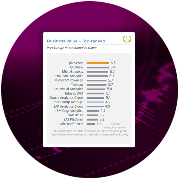 Qlik Sense earned 6 number one KPI rankings including Business Value and Analyses, and 45 leadership positions.
 -
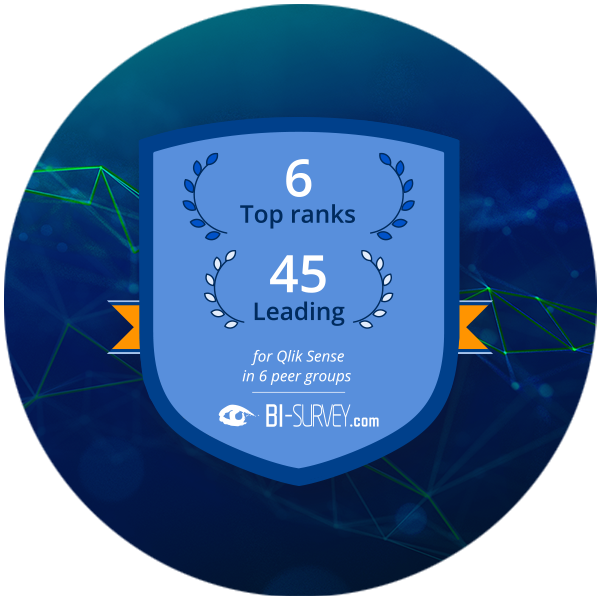 89% of surveyed users rated Qlik Sense Dashboard functionality as excellent or good.