KPI Report
Learn how to create KPI reports for quicker, data-driven decisions. This guide provides examples and practical advice to help you create a best-in-class KPI report of your own.
What is a KPI Report?
A KPI report allows business leaders to quickly and easily review and analyze key performance indicators (KPIs) and thereby know how their organization is performing against specific strategic goals. A modern KPI report uses interactive KPI dashboards with all the underlying data just a click away for deeper exploration. In this way, a KPI report makes it easy for even non-technical users to see trends, recognize relationships or uncover outliers in their data. These insights lead to actions and better business results.
KPI Report Examples and Templates
An effective KPI report streamlines data and showcases only the KPIs organizations or teams need to measure performance over time for specific strategic objectives. The examples below should help you create a best-in-class KPI report of your own.
Types of KPI Reports
-
Executive Report
An executive report monitors long-term company strategy by examining critical success factors. What may be featured?- High-level KPIs
- Predictions
- Time-based trend
-
Operational Report
An operational report shows current conditions, providing a snapshot into the way things are now. What may be featured?- Heatmaps
- Log tracking
- Log types
-
Tactical Report
A tactical report tracks progress toward a goal, providing insight into whether and when further action is needed. What may be featured?- Key data points
- More detailed insights
- Day-to-day views
-
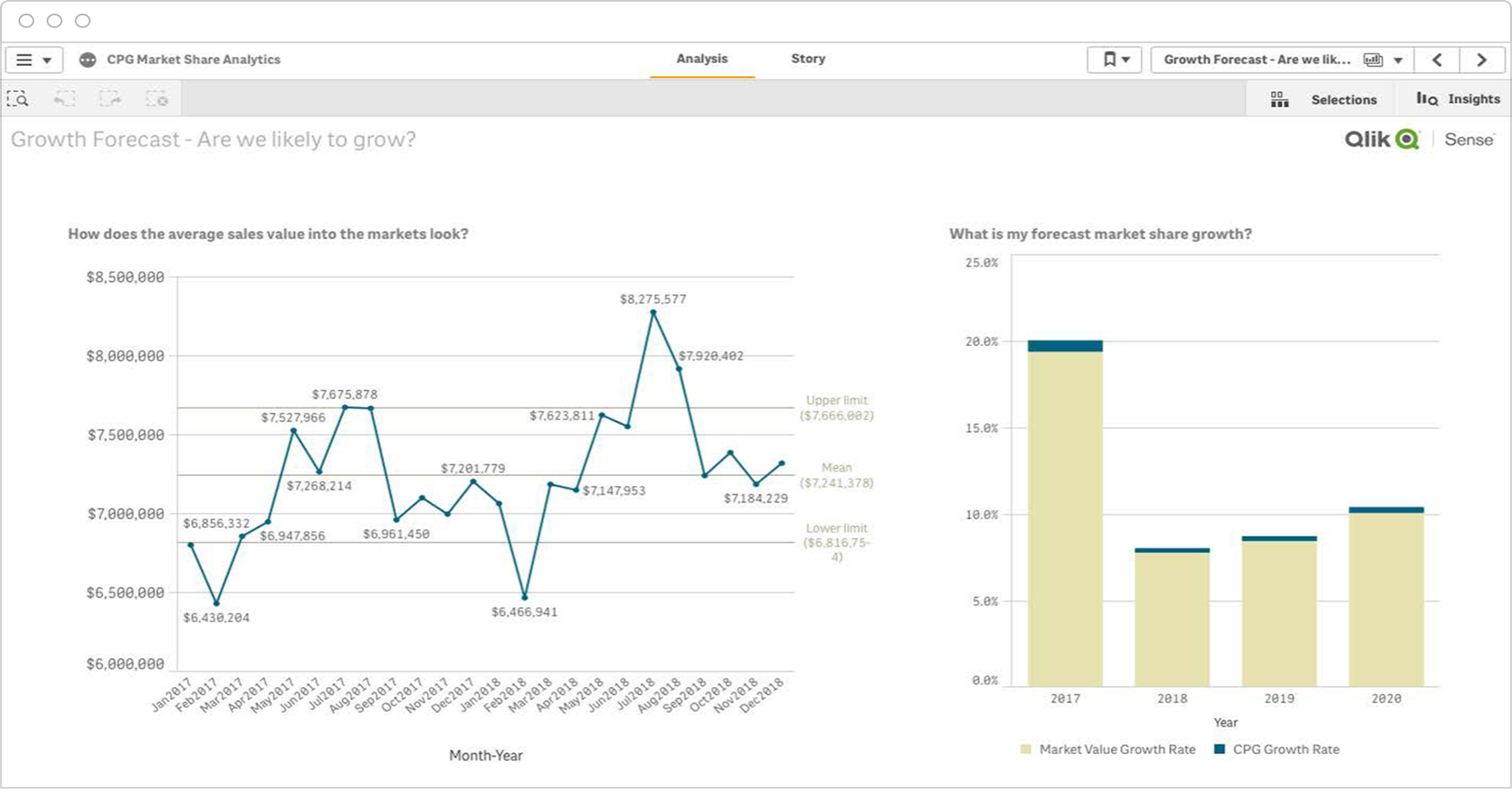
Analytical Report
An analytical dashboard report provides a very comprehensive overview of business data to drive decision making. What may be featured?- Views over time
- Forecasts
- Comparison data

Don’t just measure. Measure what matters.
Download the KPI Planning Guide to learn:
- 10 steps to strong KPIs
- Which questions help you define your KPIs
- 170 KPI examples and templates
KPI Report By Industry
-
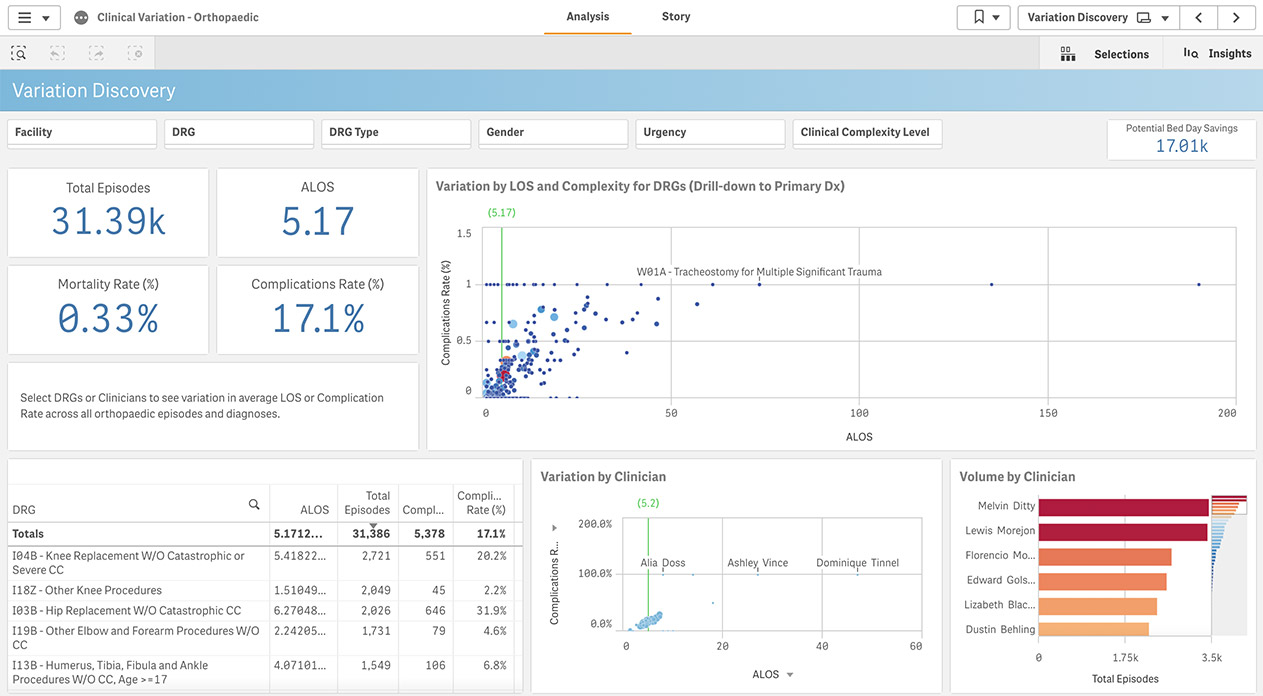
Healthcare Report
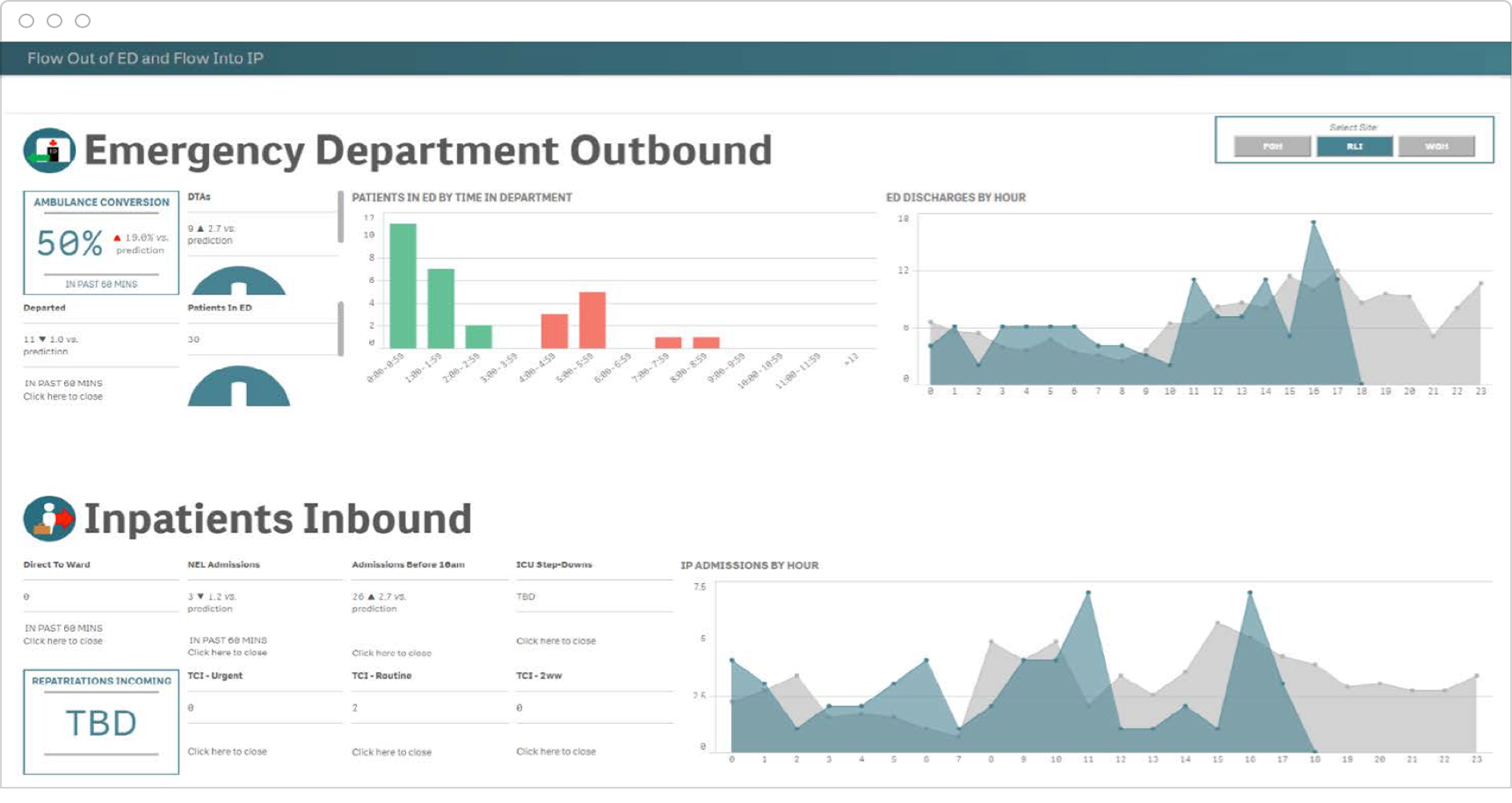
A healthcare report analyzes relevant patient care and operations indicators to improve quality while uncovering inefficiencies, featuring KPIs such as:
- Patient outcomes
- Readmissions
- Profitability
-
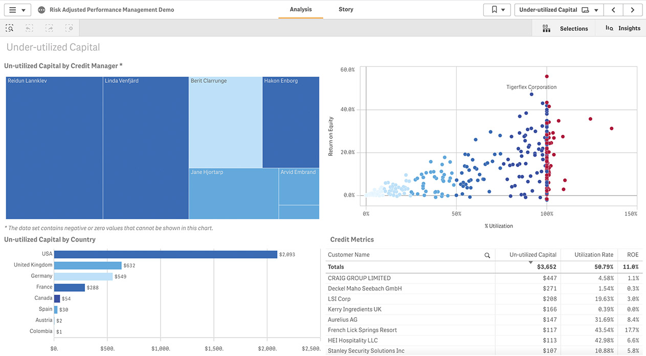
Financial Services Report
A financial services report shows KPIs such as relevant customer and team indicators to drive top-line growth while reducing costs, featuring KPIs such as:
- Utilization
- Return on assets
- Return on equity
-
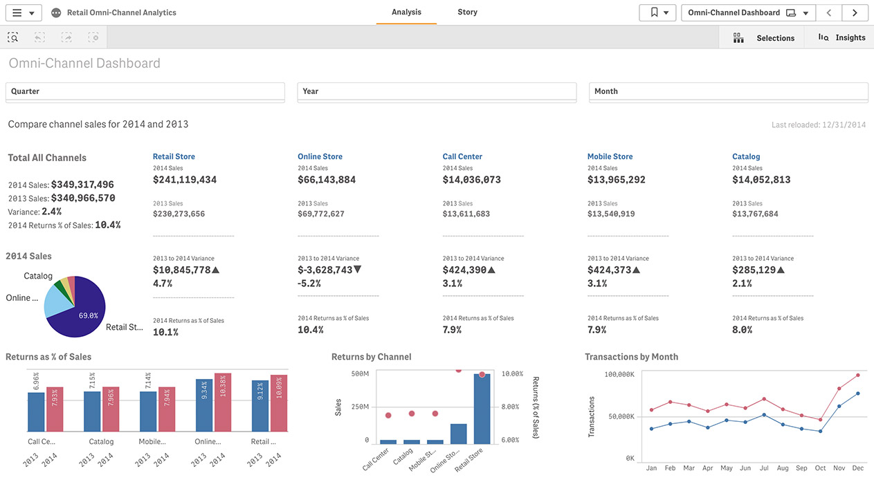
Retail Report
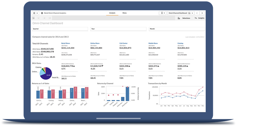
A retail report highlights KPIs such as relevant shopper engagement and associate performance indicators to maximize profits, featuring KPIs such as:
- By channel sales
- Returns by % of sales
- Transactions by month
-
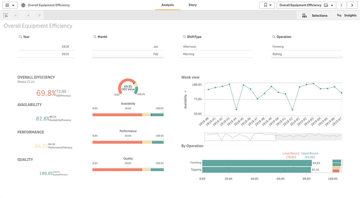
Manufacturing Report
A manufacturing report highlights KPIs such as supply chain and operational efficiency to optimize costs, featuring KPIs such as:
- Availability
- Performance
- Quality
-
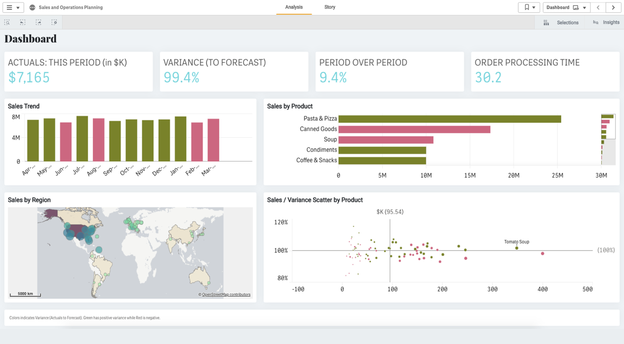
Public Sector Report
A public sector report showcases KPIs such as citizen experience and regional indicators to gain efficiencies, featuring KPIs such as:
- Actuals
- Variance to forecast
- Period over period
How to Design Best-in-Class Dashboards
Download our ebook with 4 must-see dashboard examples.
KPI Report By Job Function
-
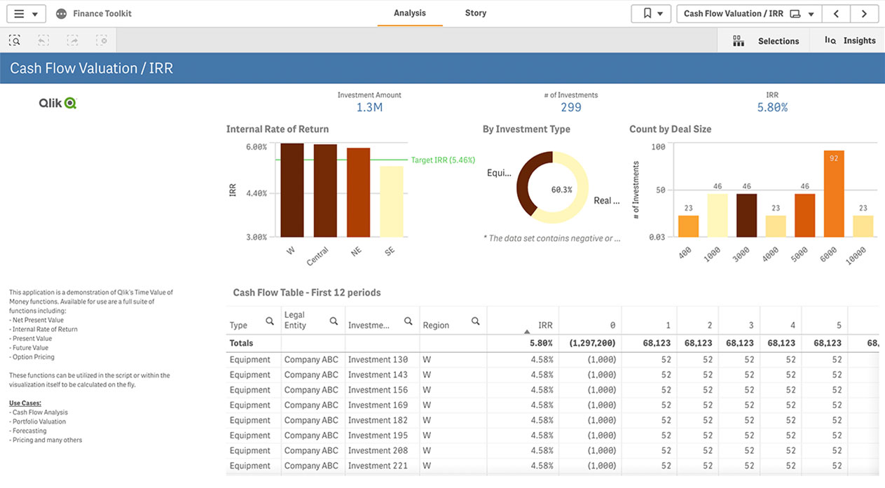
Finance Report
A finance report reveals KPIs such as the cash flow management, including KPIs such as:
- Expenses
- Contracts
- Procurement data
-
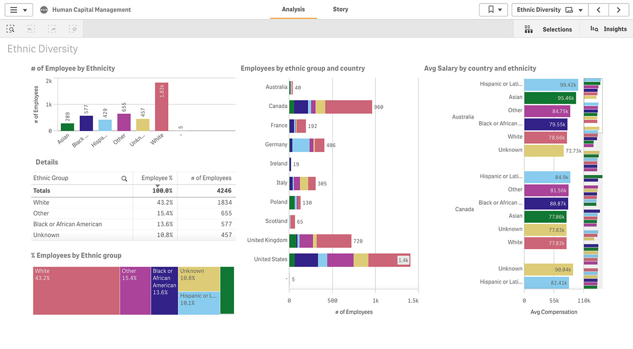
Human Resources Report
A human resources report shows employee engagement and benefits indicators to maximize retention, featuring KPIs such as:
- Absentee rate
- Time to productivity
- Quality of hire
-
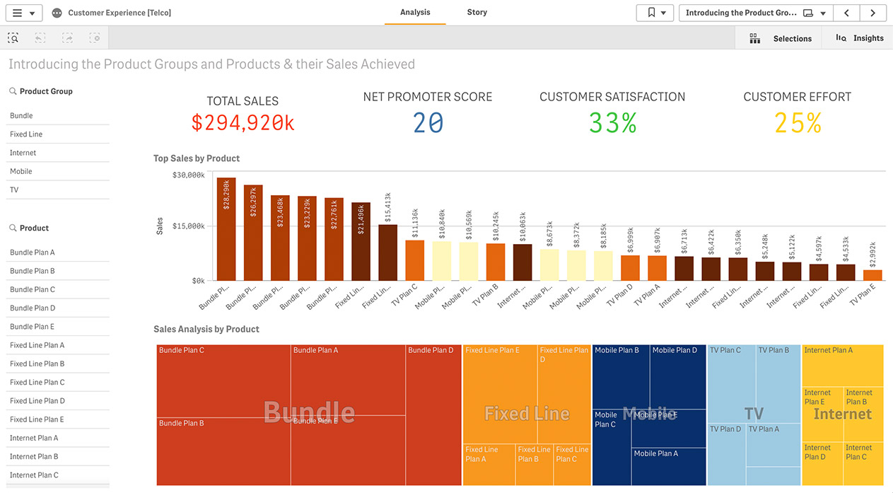
Marketing Report
A marketing report shows marketing KPIs such as Net Promoter Score and product group indicators to maximize loyalty, plus KPIs such as:
- Cost per lead
- Conversion rates
- Program ROI
-
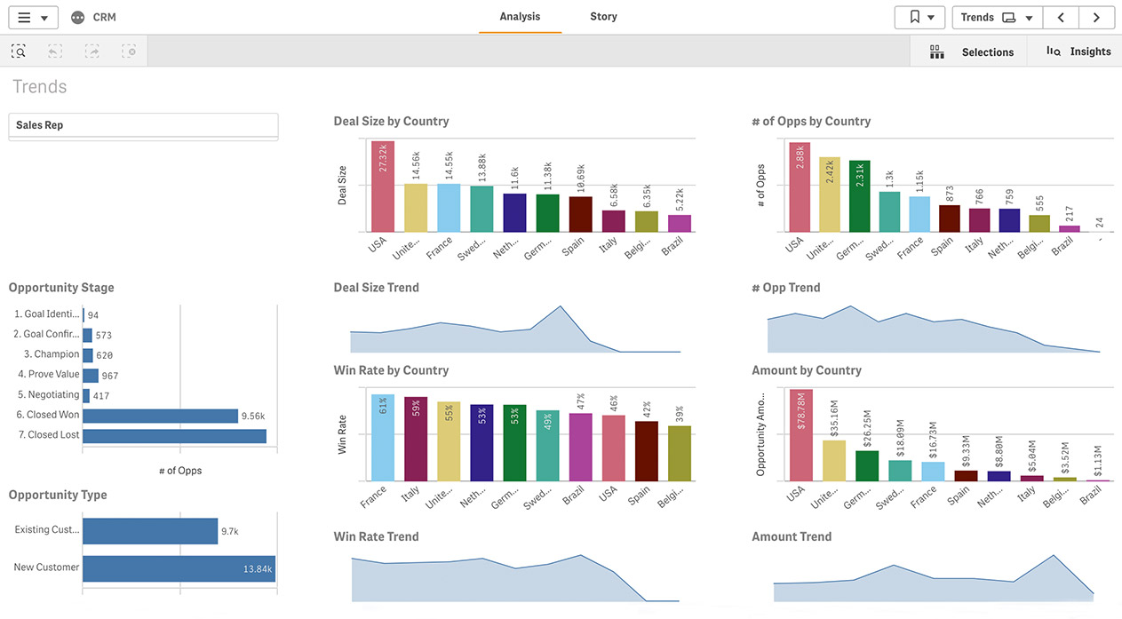
Sales Report
A sales report shows forecast and performance indicators to maximize sales, featuring KPIs such as:
- Deal size trends
- Win rates
- Deals by country
-
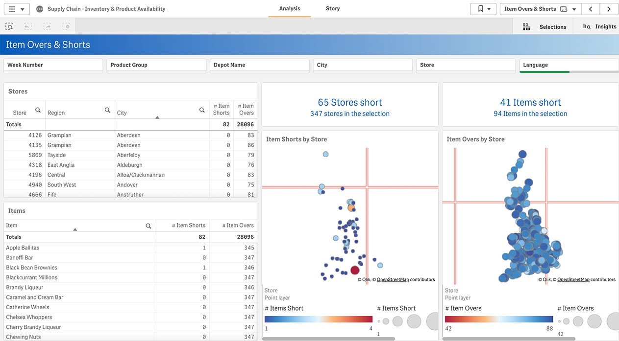
Supply Chain Report
A supply chain report showcases complex data relationships to mitigate risk, featuring KPIs such as:
- Inventory levels
- Product availability
- Sources of replenishment
-
KPI Report By Job Role
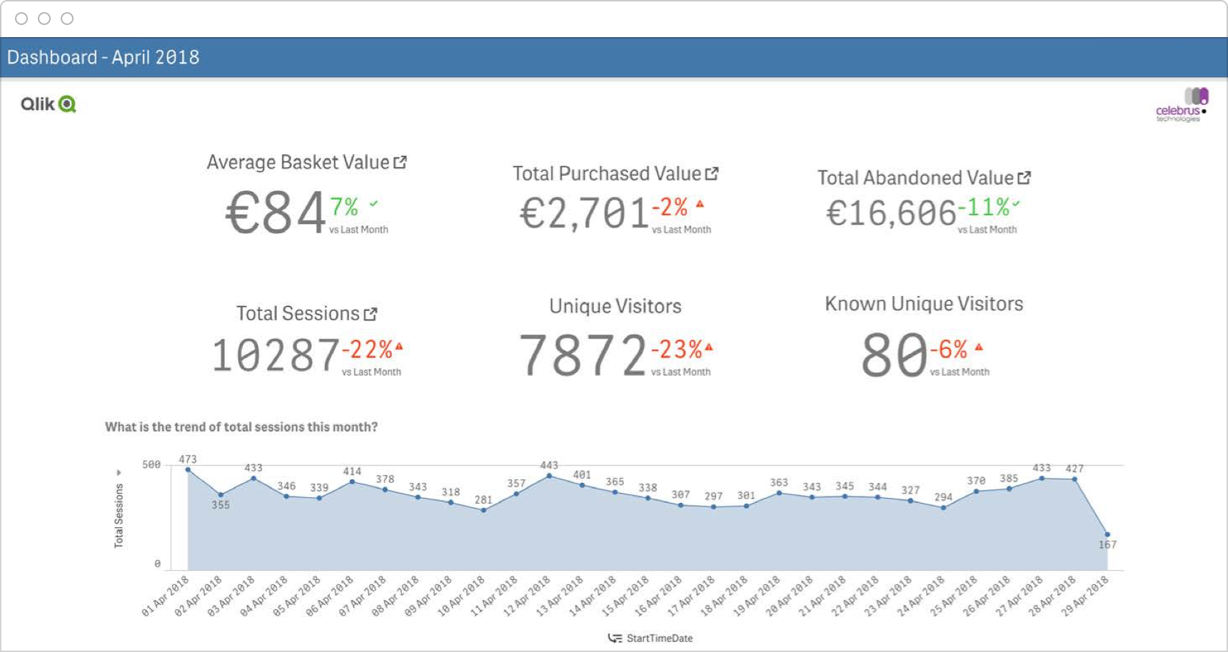
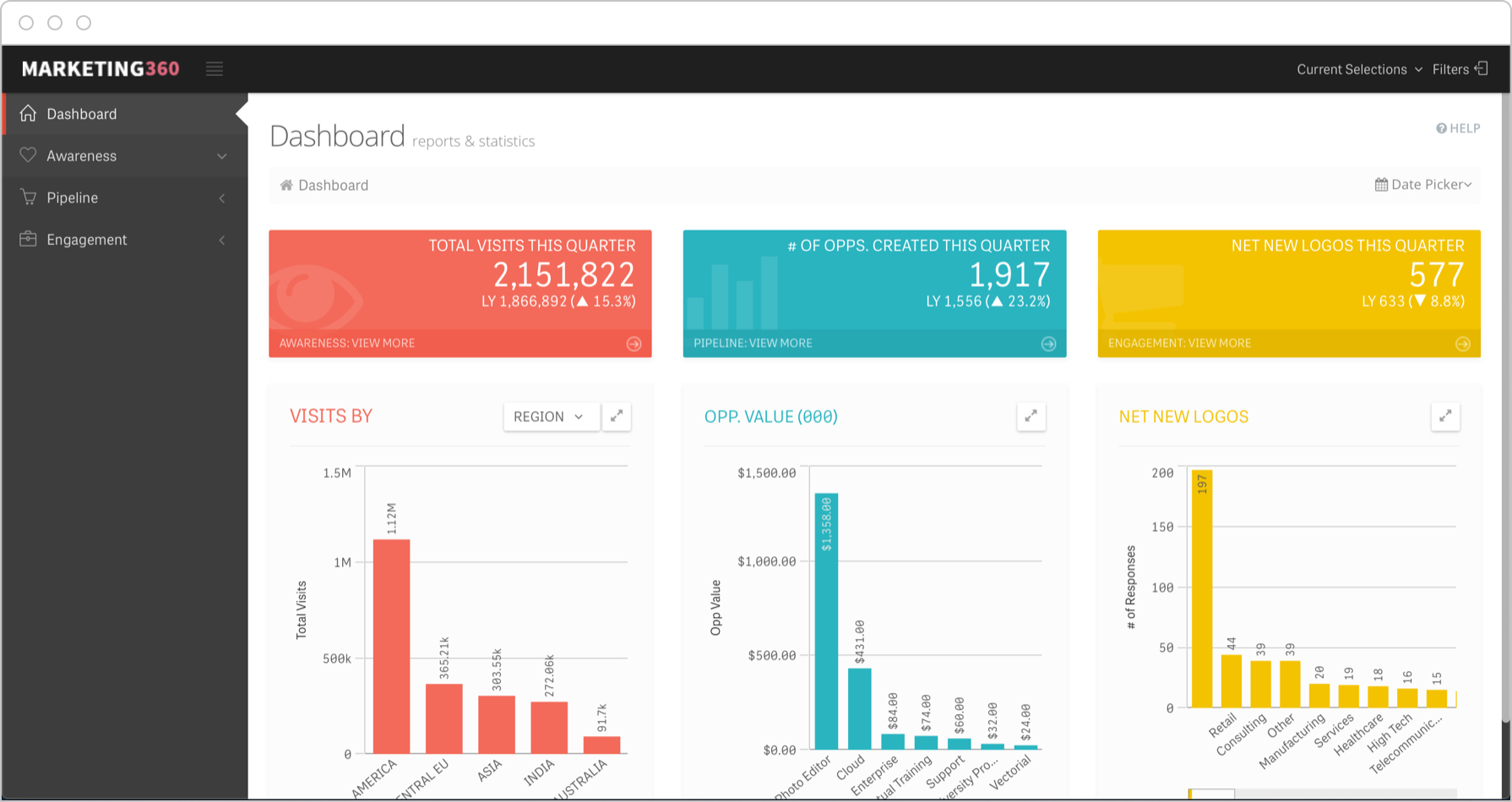 A Chief Marketing Officer (CMO) report shows performance across the entire marketing funnel to identify opportunities for improvement, featuring KPIs such as:
- Total visits
- Opportunities by quarter
- Net-new logos by quarter
-
KPI Report By Initiative
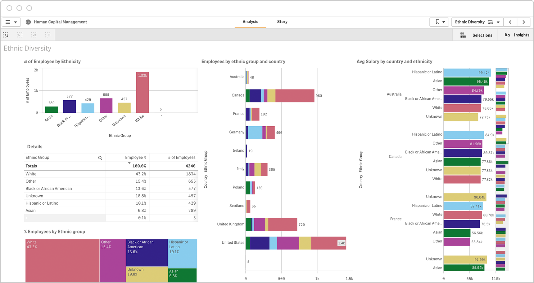
 A workforce diversity report shows demographic data by country to optimize for inclusion, featuring KPIs such as:
- Employees by region
- Workers by ethnicity
- Salary by country
The Difference Between a KPI Report and a KPI Dashboard
An interactive KPI report which allows for exploration and analysis is very similar to a modern KPI dashboard. But a traditional KPI report, produced as a static document that is distributed to stakeholders, is quite different from an interactive dashboard.
| Pros | Cons | |
|---|---|---|
| Traditional, Static KPI Report |
|
|
| Interactive KPI Dashboard |
|
|
How to prepare a KPI report: best practices
Creating a KPI report should be easier and more straightforward than it is. Because it’s not, these are some best practices:
- Strategic assessment – Create a direct link between your KPIs and your goals so audiences can evaluate the success of the current strategy at a glance.
- Glossary – Be sure to define all necessary terms in a glossary as well as KPI formulas in case external parties that may not understand the measures used will be consuming the report.
- KPI relevance – Include an explanation about why the performance indicators used are relevant or valid as a measure of success to help audiences better process the information.
- Future targets – Establish a forward-looking orientation that helps readers estimate the potential for success and provides a basis for assessing future performance.
- Trend data – Use historical trend graphs to establish context so audiences grasp how much performance has improved or gotten worse over time, and to evaluate the success of existing strategies.
- Benchmark – Provide a comparison of performance to set it in context and help readers understand positions.
Inspire Action With Your KPIs
10 ways to take your data visualizations to the next level. Learn how to choose the right ones to highlight your KPIs and metrics.
FAQs
-
A KPI report is a critical business performance tool because they provide a clear and accurate picture of organizational performance, well-being, and potential for growth. These reports help authors communicate to specific audiences about how well parts of the business or initiatives are meeting objectives. They inspire action and investment. They enable management to identify potential opportunities and challenges early, evaluate the success of existing strategies, and fail fast, when necessary.
-
There are all kinds of KPIs, depending on business objectives. For example, financial KPIs such as revenue growth rate or net profit margin, sales KPIs such as net sales or sales by region, customer service KPIs such as Net Promoter Score or average resolution time, and marketing KPIs including traffic-to-lead ratio and cost per lead. There are also operational KPIs such as order fulfillment time and time to market. See all KPI examples.

