Data Visualization Tools
2022 reviews of top data visualization software. This guide provides an in-depth comparison of the top data visualization software and offers practical advice to help you select the right solution for your organization.
Data Visualization Tools Guide
What Are Data Visualization Tools?
Data visualization tools allow users to easily create graphics and imagery that help them make sense out of large amounts of data. Graphs, maps and charts allow them to quickly see trends, recognize relationships and uncover outliers in their data. The result is more informed decision-making, which can increase efficiency, revenue and profits.
Data Visualization Tools – Compare The 3 Gartner Leaders
In their 2023 Magic Quadrant Analytics & BI report, Gartner named only three vendors as Leaders: Qlik, Power BI and Tableau. That’s because interactive data visualization at scale requires a suite of supporting capabilities that only the very best tools deliver.
See below for in-depth reviews of the best data visualization tools on these 10 features:
1. Data Visualization
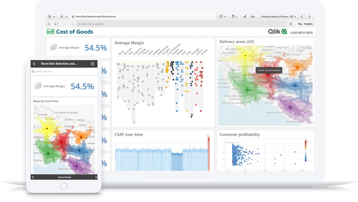
Most tools can visualize data in graphs, charts and maps. Modern tools make these visualizations interactive, and some offer AI to assist in chart creation, pinpoint outliers, and suggest new visuals. The best tools allow you to freely explore all your data, in any direction, directly from within the visualization.
-
Qlik Sense
Qlik offers a full range of interactive visualizations and robust AI support including association recommendations and data preparation. Plus, Qlik features a unique “associative” data engine which lets you explore ALL of your data from any angle, directly within the visualization.
-
Tableau
Tableau offers a full range of visualizations. In fact, this is what Tableau’s best known for. But as with their dashboards, you’ll be limited to the query paths the author preselected when you want to interact with the visualization.
-
Power BI
Power BI also offers a full range of visualizations. And while these visualizations are interactive, your exploration and filtering will be limited by preselected query paths.
2. Dashboard Exploration
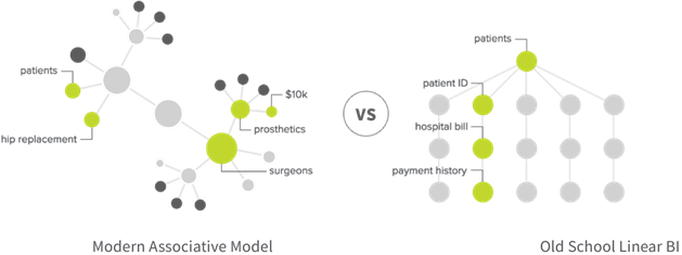
Most data visualization tools can also create cool-looking dashboards. Unfortunately, most tools are traditional, query-based platforms which limit your exploration to predetermined paths. Your tool should allow end-users to explore their data freely, in any direction and to use data from unlimited sources.
-
Qlik Sense
As with visualizations, Qlik’s “associative” data engine which lets you explore ALL of your data from any angle, directly within dashboards. Qlik’s cognitive engine uses machine learning to get smarter over time – giving you ideas of what to explore next.
-
Tableau
Because Tableau uses a SQL database, users are restricted to specific, predetermined paths within a narrow portion of data. That means the platform only analyzes part of your data, leaving out key patterns and connections.
-
Power BI
Power BI also operates on a SQL database, restricting users to query paths that are linear and predetermined.
10 Ways to Take Your Visualizations to the Next Level
3. AI-Powered Recommendations
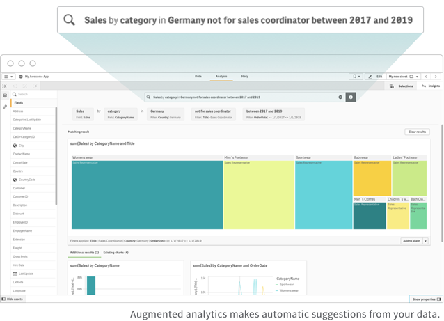
The best data visualization tools help you get better insights faster. With the power of AI and machine learning, augmented analytics helps you quickly analyze your data from angles you may not have considered. This helps you increase productivity and make better decisions.
-
Qlik Sense
Qlik includes a full range of AI capabilities which are built into the platform at a foundational level and span different users and use cases. For example, you can ask questions in natural language and get in-depth answers. And as you explore your data, Qlik automatically makes suggestions for new ways to look at your data.
-
Tableau
Because Tableau’s Ask Data feature is not core to the platform, it only connects to data sources, which means it can’t leverage the insight your analysts have built. Specifically, it doesn’t work with the business logic built into workbooks because it can’t access workbooks.
-
Power BI
Power BI bolted on Microsoft AI to add the Quick Insights and Q&A features. Accessing these features requires you to purchase the whole Microsoft stack. And, once you do, these are objects on a dashboard that you need to include every time.

4. Fully Functional Mobile Experience
Users should be able to create rich data visualizations and fully analyze their data at any time, on any device they choose. The best data visualization tools provide a fully functional mobile app that empowers users to deeply explore data and generate insights wherever they are.
-
Qlik Sense
Because responsive design and touch are native to Qlik, users can complete the same functions on the full-native mobile app that they can on their desktop or laptop—even offline.
-
Tableau
Tableau’s mobile app limits you to basic functions, such as downloading one sheet from a larger workbook. You can’t filter, either. Instead, you’ll have to highlight one value at a time and then scroll around to find where that value displays in related charts.
-
Power BI
Desktops are the main tools for Power BI users, and you’ll have to use different pieces of software for different tasks. Power BI offers cloud capabilities for uploading reports—with limited editing capabilities.
5. Scalability
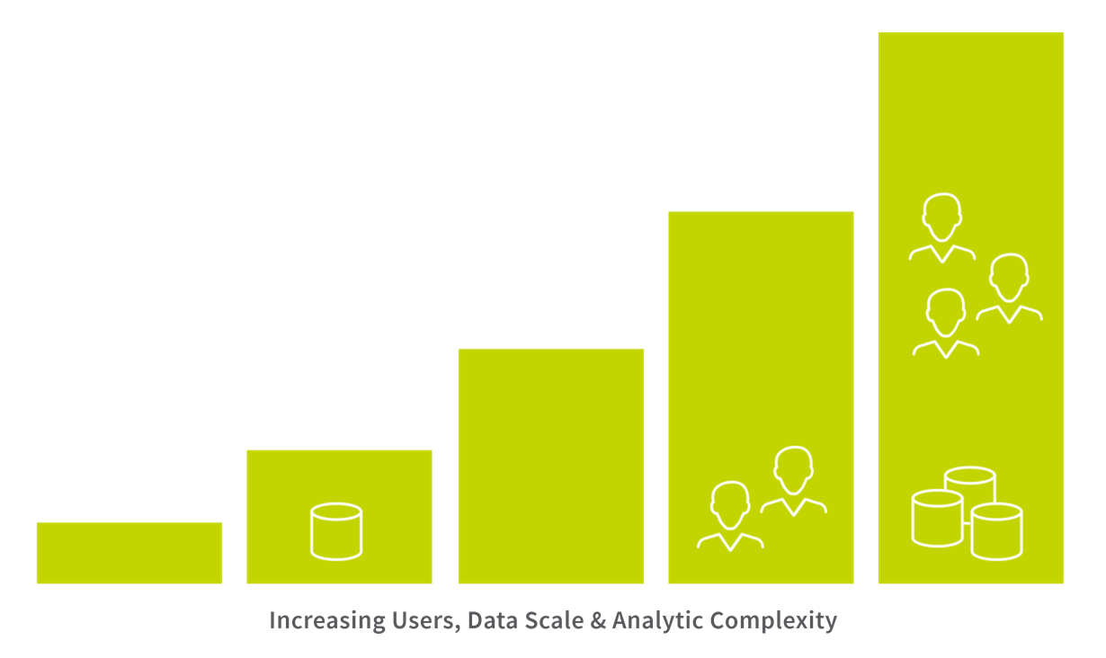
To get the most valuable insights, you need a complete view of all your datasets, large and small. That means bringing data together from multiple sources in near real time. Be sure your data visualization platform can handle large amounts of data without increasing cost or degrading performance.
-
Qlik Sense
Qlik’s associative engine provides instant calculation performance, even with massive data sets, real-time data and high numbers of users. And, with the ability to add, change or remove records, you can keep data updated in a much smaller build window.
-
Tableau
Tableau has trouble processing large volumes of disconnected data—especially when complex analytics are involved. In addition to slower performance, you can’t increment data and keep it fresh in small build windows.
-
Power BI
Power BI can get very expensive when operating at scale. Power BI Pro’s has an extremely low limit of 1GB per data set, so it’s likely that you’ll quickly need to upgrade to Premium.
6. Embedding Visualizations
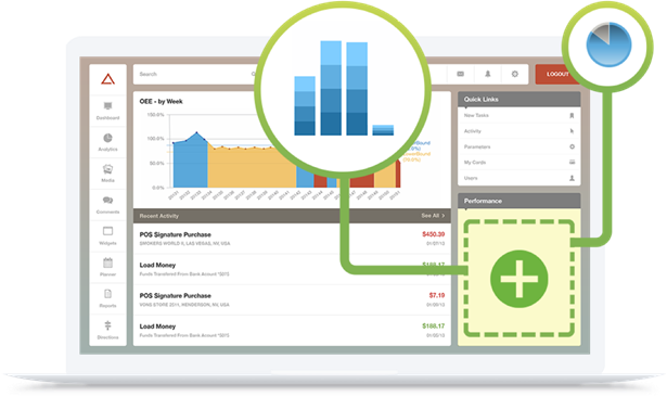
With embedded analytics, employees, partners, customers and suppliers can visualize and analyze data using their everyday applications. Also known as OEM or white label analytics, embedded analytics helps users make better decisions faster by making insights available in portals and processes. Big data visualization tools should embed analytics functionality across the enterprise by providing open APIs and an extensible platform.
-
Qlik Sense
Qlik offers a variety of APIs to help you integrate with your web and application technologies, including products, portals, workflows and edge devices. For example, embed a dashboard into your mobile app, complete with individual numbers, values and metrics.
-
Tableau
Tableau offers a very limited amount of APIs. For example, you can only embed a complete dashboard, not individual values.
-
Power BI
Power BI does allow for dashboard and object embedding, but Power BI is not API-first and many capabilities are not available in their software development kits.
In BARC’s survey of real BI users, Qlik Sense ranked #1 in critical KPIs including Performance Satisfaction, Dashboards, and Project Length in its peer groups.
7. Deployment Flexibility
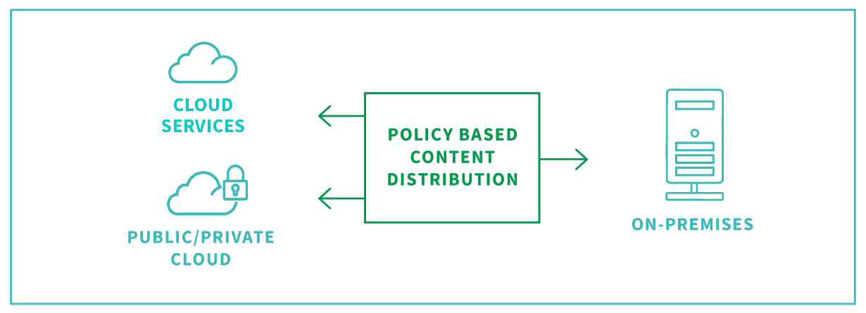
The best data visualization tools allow you to deploy your data any way you choose—regardless of platform or cloud architecture. Steer clear of solutions that lock in your data, restrict your cloud analytics strategy or require new infrastructure.
-
Qlik Sense
Qlik provides a full enterprise SaaS environment and both on-premise or private cloud options. Qlik is also independent, so you have total freedom and control of your data.
-
Tableau
Stability is important. Now that Salesforce owns Tableau, what does that mean for Tableau customers’ data? You don’t want to be left wondering where your data could end up or whether or not it could get locked in.
-
Power BI
When it comes to deployment, Microsoft’s Power BI offers one cloud option: Microsoft’s cloud solution, Azure. And, because the cloud experience differs from on-premise, the user experience could get bumpy.

8. Governed Self-Service
Trusting your data while also allowing many users to generate their own insights is a tricky balance. The best data visualization tools allow you to securely manage your data in a centralized way using rules-based governance. At the same time, they also give users access to self-service analytics so they can explore their data without calling on IT or an analyst for help.
-
Qlik Sense
With Qlik, all content creation on Qlik happens in the cloud, where it’s governed and controlled. These governed libraries provide reuse and standardization for analytics. Qlik also centralizes and unifies your data, creating governed data models with robust data security.
-
Tableau
With Tableau, users keep work on their hard drives. Because it’s desktop software, users may or may not share on a server. That means potential issues with version control, and the chance your data could become polluted or outdated.
-
Power BI
Managing and validating data with Power BI is challenging. Because the platform decentralizes data, it’s scattered across user desktops and the cloud.
9. Single Platform for Many Use Cases
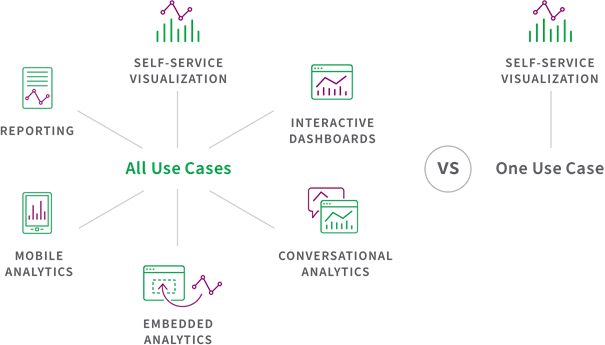
A modern data visualization platform should allow many different types of users, such as analysts, engineers and businesspeople to use the same platform and data to perform many different use cases—like exploring data, embedding analytics, or creating interactive dashboards.
-
Qlik Sense
All users in your business can perform all activities—from visualization to data analysis—on the same platform with a common analytics engine, AI capabilities and analytics data pipeline.
-
Tableau
Tableau focuses on a single use case: data visualization. However, to create these visualizations, you’ll need business authors who have database and SQL expertise.
-
Power BI
With Power BI, you can perform a range of uses if you invest in a range of Microsoft products. And you’ll need to switch between multiple products to do so.
10. Data Integration
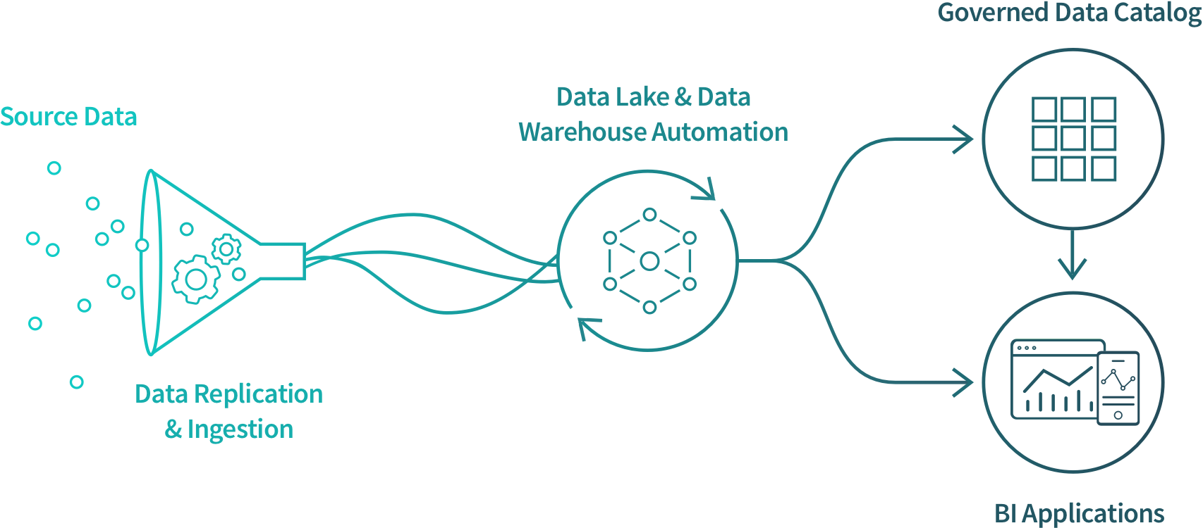
The most vivid images in the world mean nothing if you don’t start with the right data. Effective visualization tools integrate data from across the enterprise and provide business users with a data catalog that makes it easier for them to find what they need—no matter what their skill level.
-
Qlik Sense
Qlik Sense has best-in-class Data Integration capabilities for combining and transforming data and data cataloging. Qlik also offers an enterprise class Data Integration platform providing a seamless analytics data pipeline.
-
Tableau
Tableau has data prep capabilities in Tableau Desktop and in Tableau Prep. But they solve different problems (and neither can solve all). So which should you use? And what do you do about the data problems Tableau can’t solve?
-
Power BI
Power BI’s disparate offerings makes it hard to integrate your data. To make it work, you’ll need to buy and add stack products.

BONUS FEATURE: Supporting Data Literacy
The best big data visualization tools go beyond just teaching people how to use their platform. Instead, users should learn how to be data literate, helping them understand how to analyze and communicate with visual data.
-
Qlik Sense
Users of any skill level can freely explore their data using Qlik’s self-service tools. For instance, users can create reports with a simple drag-and-drop. You can also take advantage of Qlik’s data literacy as a service—an offering that blends training, processes and technology.
-
Tableau
Tableau requires you to be an author to make discoveries. So their data literacy initiative is only focused on authors. That’s data literacy for data dictators and leaves the rest of us behind.
-
Power BI
The only Power BI users who can access self-service are authors. After content has been published, there aren’t a lot of options for other users to further interact with data. For deeper exploration, users need to go back to the author.
How to Design Best-in-Class Dashboards
Download our ebook with 4 must-see dashboard examples.
Total Cost of Ownership
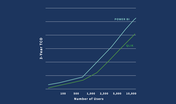
Your data visualization software should provide full transparency into total cost of ownership.
Total cost of ownership (TCO) covers more than just the cost of software. It also covers costs over a 3- to 5-year period, including systems setup and development, infrastructure, and systems admin and support. Be sure your data visualization tools vendor discloses the total financial and time commitment required to use their platform.
-
Qlik Sense
Qlik offers lower TCO than Tableau or Power BI, and doesn’t require extra data or compute costs down the line. With Qlik, you get total transparency.
-
Tableau
To replicate what’s in a single Qlik app, you’d need to create many Tableau reports. That would take time, and time is money. Plus, refreshing that content could cost extra.
-
Power BI
Power BI users who want to work at the enterprise level will have to pay substantial upgrade and add-on fees. Learn more.

